Case study · 2025
Navy KPI Dashboard
A single-screen dashboard concept that translates execution, quality, delivery risk, impact, and customer experience into a leadership decision narrative.
- Client
- U.S. Navy N16 eCRM Line of Effort
- Role
- HCD Strategist, UX Designer, and Dashboard Architect
- Governance
- Outcome-oriented performance framing
Overview
Framing performance across delivery, quality, and experience
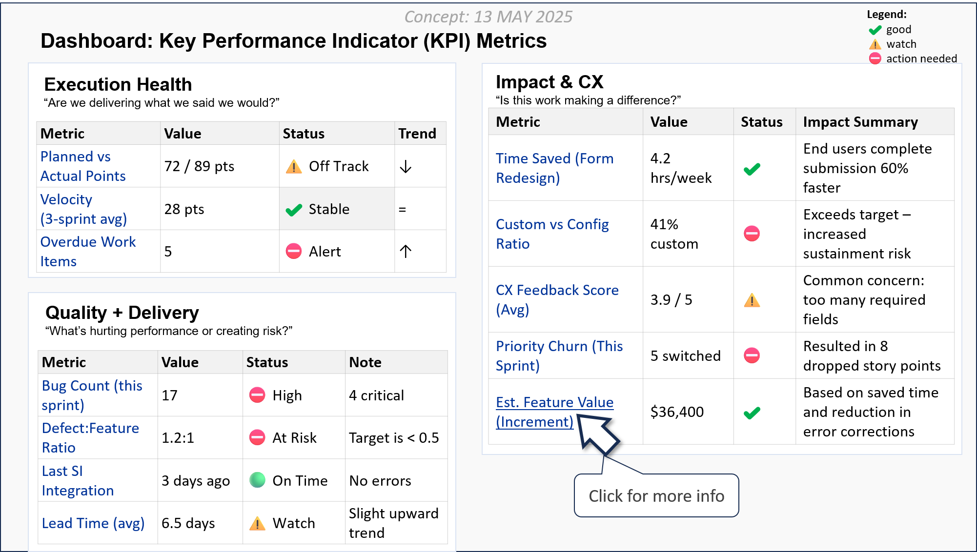
The concept brings technical delivery measures, quality and risk signals, and customer-experience outcomes into one leadership view. Visual hierarchy and short narrative summaries are intended to elevate operational risk, surface user impact, and connect delivery performance to mission outcomes.
Design goals
Support decisions rather than merely report metrics
- Provide a single-screen performance lens integrating delivery, quality, and experience.
- Make urgency, direction, and impact understandable at a glance.
- Support cross-functional planning and prioritization through clear segmentation and language.
- Encourage outcome-oriented conversations rather than isolated metric reporting.
Information model
Three questions organize the dashboard
- Execution Health: Are we delivering what we said we would?
- Quality and Delivery: What is hurting performance or creating risk?
- Impact and CX: Is the work making a meaningful difference?
Visual hierarchy
A scan path from status to interpretation
The three-zone layout reduces cognitive load by separating different decision contexts. Within each zone, consistent columns and spacing let leaders scan the metric, current value, status, trend, and interpretation without decoding a different pattern for every measure.
Status and trends
Signals reinforce stability, watch conditions, and action needs
Status icons and trend arrows add a second layer of meaning to labels such as Stable, Watch, Off Track, and Action Needed. The words carry the meaning; color and icon shape provide reinforcement rather than acting as the only status cue.
Impact summaries
Pairing measures with plain-language consequences
Narrative summaries explain why a measure matters—for example, whether a form change saves user time, configuration choices create sustainment risk, or priority churn drops planned work. This makes the dashboard useful to leaders who do not share the delivery team’s metric vocabulary.
Accessibility considerations
Meaning must remain available beyond color
- Every status requires a visible text label in addition to color and iconography.
- A production implementation should preserve a logical reading order and expose table headers programmatically.
- Trend arrows require equivalent text such as increasing, decreasing, or stable.
- Interactive metric details require keyboard access, visible focus, and an accessible expanded state.
Strategic value
Turning delivery data into a story of impact
The concept reframes a complex delivery landscape around the questions leadership needs to answer: where work is stable, where intervention is needed, what risks are accumulating, and whether delivery is creating value for users and the mission.
Validation boundary
A concept requiring operational and accessibility validation
The dashboard image demonstrates the proposed structure using illustrative values. Before operational use, metric definitions, sources, thresholds, calculation ownership, refresh cadence, drill-down behavior, and accessibility would need validation with leaders, delivery teams, data owners, and users with disabilities.