Case study · 2019
March for Science Site Redesign
A UX and knowledge-management redesign that made participation easier, unified desktop and mobile experiences, surfaced current content, and reduced reliance on one site administrator.
- Client
- March for Science
- Role
- UX/KM Strategist and Site Designer
- Governance
- Stakeholder-validated HCD and distributed content stewardship for a volunteer-led nonprofit
Situation
A successful social presence without a sustainable website
The young, volunteer-led organization was effective on social media but needed its own website to become more relevant, usable, and viable for its varied stakeholders.
Task
Align stakeholder needs, UX practices, and content operations
The assignment was to assess and redesign the site around known leadership concerns, UX good practices, and needs uncovered through stakeholder interviews—then validate the resulting structure and pages with the people who would use and maintain them.
Process
From stakeholder evidence to iterative delivery
- Captured detailed stakeholder feedback and needs.
- Consolidated, verified, and prioritized requirements.
- Defined and validated the information architecture.
- Created draft Wix pages in place of separate wireframes so stakeholders could react to realistic page behavior.
- Developed, validated, and iterated pages with stakeholders.
Key discoveries
The content model and operating model both needed attention
- Inconsistency: The original site was organized unintuitively and behaved inconsistently across desktop and mobile layouts.
- Participation: Donation, shopping, and volunteering were not prioritized even though the organization depended on them.
- Freshness: The website appeared stale because current news lived primarily on social media.
- Credibility: The site did not clearly demonstrate the organization’s successes and community relevance.
- Continuity: One administrator maintained both structure and content, creating workload and continuity risk.
Information architecture
A consistent experience across desktop and mobile
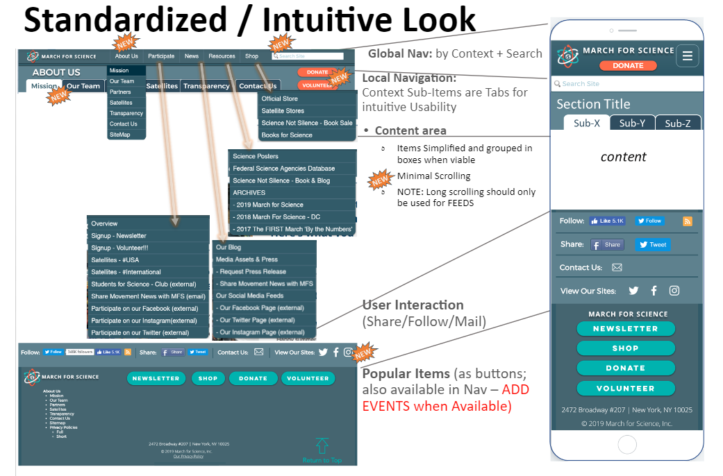
The redesign standardized global navigation, introduced contextual local navigation, simplified content regions, and made participation actions persistent across responsive layouts.
Design iteration
Giving each organizational success room to be understood
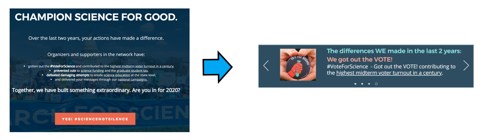
Leaders initially requested a paragraph-style successes section. A mockup revealed that the treatment felt too heavy, so feedback from leaders and users led to a carousel that reduced simultaneous content while giving each result individual focus.
Participation
Making support opportunities difficult to miss
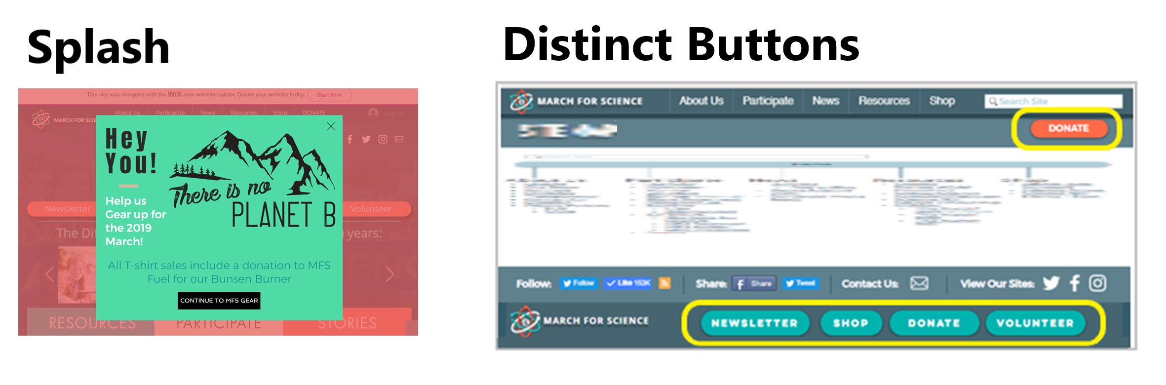
Donation, shopping, newsletter, and volunteer opportunities became distinct and persistent actions, supplemented by timely campaign overlays.
Knowledge management
A one-stop source for current news and reusable resources
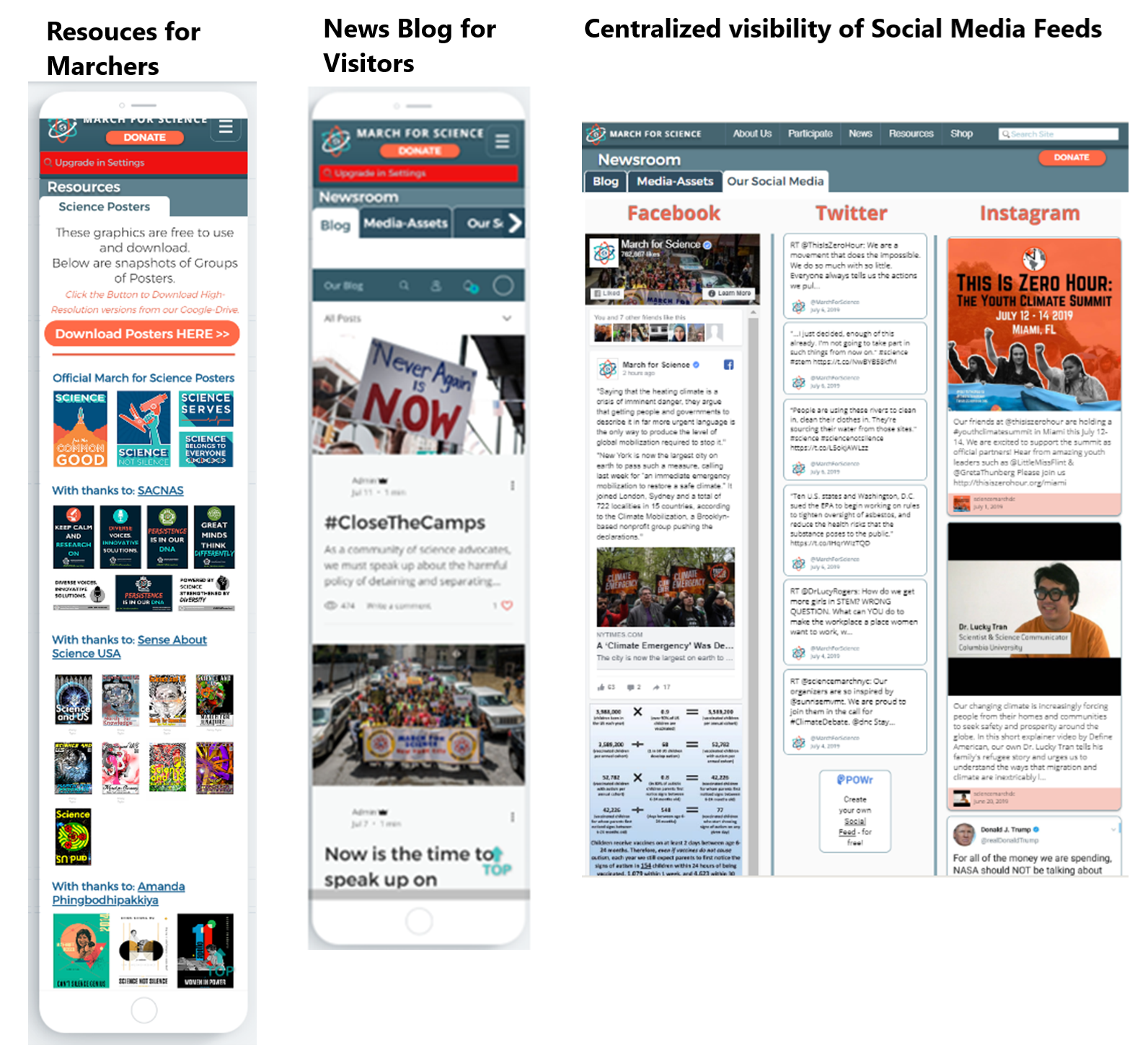
The redesigned site centralized social feeds, added site-owned news sources, and improved access to existing resources such as downloadable poster graphics. Content providers could maintain their own material, reducing the workload and continuity risk concentrated in one administrator.
Result
A more useful site with a more sustainable publishing model
The resulting desktop and mobile experience made donation and volunteer paths easier to find, surfaced fresher content from across the organization’s web presence, and reduced future administrative effort through better structure and distributed stewardship.